12 Best Color Palettes for an Attorney Web Design

Selecting colors for your brand and your website is one of the most fun (and most difficult) processes of website design.
When choosing law firm color palettes, you need to consider the psychology of color, color combinations, and ADA-compliant color schemes.
There are so many options to choose from when it comes to legal color palettes–the possibilities are endless.
Our professional designers have selected and worked with lawyer color palettes for thousands of websites.
Here are some color palette ideas you can use for your brand.
Cahill & Perry

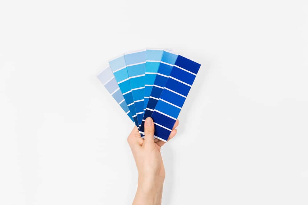
Using a blue color scheme is a classic choice for attorneys. This railroad injury firm shows calm and trust through this cool-colored palette, when you consider color theory.

Brekke, Clyborne & Ribich

A red color palette is another common choice for attorneys. These reds give a sense of tradition, power, and professionalism.

Rella & Associates

Greens and yellows are more of a unique choice for an attorney web design. However, when done right, it can give a sense of growth, peace, and renewal.

Dobberstein Law Group

The cool-toned blues and the warm-toned yellows give great contrast colors to this law firm website design. These colors complement the natural colors of Las Vegas well.

Manzoor Law Firm

Using the same blues and yellows of Dobberstein, this lawyer website design takes a more muted approach. The soft color palette promotes calm and peace.

Tierney Law Group

This attorney website design has a bit of a unique color palette. The neutral beige gives off a natural and organic feeling, while the black and white provide a pop of high contrast that catches a user’s attention.

Ashton E. Thomas

This color scheme also provides a great contrast that is memorable and stands out. Teal colors give off a sense of both calm and renewal, which works well for a firm that focuses on personal injury, employment, and traffic law.

McLario Helm Bertling & Spiegel

Cool-toned colors are often described as calming and even nurturing. This firm focuses on being a law firm for life, so this cool-toned color palette works well for their mission and goals.

Freeman & Chiartas

Reds and golds give off a sense of power, strength, and traditionalism. This firm has extensive experience with personal injury and employment cases, and they have experience with “aggressively taking cases to trial.”

Hutchings & Schwappach

Most of the colors on this website are black and white and gray, but the bright pop of orange color creates interest and emphasizes the most important info on the page (such as the call-to-action buttons).

Neal-Lopez Law Group

You don’t often see purple colors in attorney web designs, but this color palette works well. The soft lavender color gives a similar feeling that a soft blue would: calm, trust, and peace.
Coates Law Office

Blues and greens are a common choice for lawyer website designs, however, the slightly muted green against the vibrant blue creates a color pairing that’s unique and new, while still keeping that sense of tradition.

There are many options when it comes to choosing a color palette for your law firm website–just make sure they convey the emotions and the look you would want that’s consistent with your brand.
Did you like this post? Here are some others you might enjoy:

By Benjamin R. Gold, Esq., Founder of Lawyer Stories Over the years, I’ve had the privilege of interviewing over two…

Managing multi-location SEO for law firms is about earning visibility for each office without creating pages that feel repetitive or…

Law firms can compete without large marketing budgets by building durable visibility, improving conversion efficiency, and earning trust faster than…


