
Best Lawyer Fonts for Your Website Design

Quality law firm website design involves numerous factors, including fonts for lawyers. Learn more about the best fonts for lawyers, and work with experts who can help you place your digital marketing campaign in the best position possible to be successful.
Elements of Fonts
If you work with professional law firm website designers, you will quickly realize there are numerous elements of fonts you need to consider. You need to weigh the benefits and drawbacks of each lawyer font before you decide which one is right for you. A few important elements of fonts include:
Serif versus Sans Serif
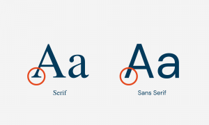
While these two typefaces might look similar, they have their differences. Their decorative strokes, mood, and legibility are different. For example, serif is often considered more formal, while sans-serif could be considered more casual. Some people also believe that serif is easier to read when printed, while sans-serif is easier to read on screens.
Color
You need to think about the color of your font. If you want to create a professional impression, then black is probably the best option to use in large and small law firm website design.
Size

Consider how big your typeface is. You need to make sure it is big enough to read, but you do not want it to be so large that it is hard to fit all the information on a single screen.
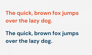
Font Pairings

You also need to think carefully about pairing multiple fonts together. For example, you may want to use one font in the heading and one in the body.
Bold, Italics, and Underlines
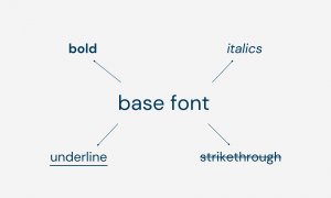
If you need to draw attention to important elements on the page, then you may want to use bold, italics, underlining, and strikethrough. Just make sure you are consistent with how you use the emphatic accouterments.
Letter Spacing

Do not overlook letter spacing. You need to make it easy for people to tell which letters make up a single word, but you do not want to put the letters so close together that people have a difficult time reading them.
Line Spacing

Finally, you should also consider line spacing. If you add a bit more space between the lines, then they make the text easier to read; however, if you put too much distance between the lines, your readers could get lost.
Keep these tips in mind when you are deciding which font is right for your attorney website.
Where Are Fonts Used?
So, what font do lawyers use? There are numerous locations where your typeface might show up on the screen of a potential client or business partner, here are four big ones:
Legal Documents
Your fonts are going to show up all over your legal documents, regardless of whether you print them out or post them online. Real estate transactions, criminal court documents, financial documents, and even documents that might be involved in civil lawsuits will need to have a font you select. You need to think carefully about how your font is going to appear on these documents.
Branding and Logos
Your font is also going to show up on all branding and logo materials. For example, if you post a billboard on the side of the road, your font is going to show up here. If you purchase space on a television channel for a commercial, your font is also going to show up on the screen. If you have a logo you use on your website, your font is also going to show up there.
You should also think carefully about the typeface you use in your email. When you send emails to your partners, clients, and business partners, you need to make the right impression. You should think carefully about what font you use in your emails.
Website
Finally, your font is also going to show up all over your website. You have to make sure you select the right option. For example, if you have a blog, your font is going to show up there. Your font is also going to show up on the front pages of your websites. If you have a chat window you use to communicate with interested people, your font is also going to show up in this box. You must make sure you select the right option for your website.

What Fonts Should Your Law Firm Use?
Legal Document Fonts
So, what type of font should you use for your documents? It depends on where you are posting your content. For example, if you have legal documents that you need to submit, you need to make sure you follow all the rules and laws. You should typically avoid Times New Roman, and make sure you pay attention to the rules in your specific state.
In general, you may wish to stick with century-family fonts for legal briefs. A few examples you may want to use as your legal fonts include Century Schoolbook, Georgia, Baskerville, Bookman Old Style, Helvetica, and Century Gothic. If you go with one of these options, you should be on the right track.
Branding and Logo Fonts
If you are trying to pick the right font for your branding information, you can really go any way you would like.
There are a lot of factors you need to consider when you are trying to find the right font category for your information. You should think about your brand personality, consider your budget, and make sure you don’t run into any licensing requirements. Of course, you should make sure your typeface is easy to read, catches the attention of your readers, and effectively communicate the information you want to convey.
We actually looked at a ton of law firm logos, and here’s what we found:

We found that 64% of law firm logos had a serif font and 36% opted for a sans serif font. You can really choose between the two.
Email Fonts
If you are trying to find a strong font for your emails, there are several factors you should consider for this as well. You should consider the spacing between the letters, think about the font of the display, and choose the right size. That way, you know the email is going to show up appropriately on the other person’s screen. That way, you know your information will be interpreted correctly.
The best way to see which font is best is to ask! Send out some test emails to friends and coworkers to see which one you should choose.
Website Fonts
Finally, you might also be thinking about the body of your website. Through our quick study, we found some interesting things.
We first looked at a ton of lawyer websites and saw if their headings were in a serif or sans serif font.
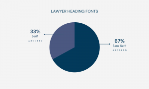
We found that 33% of lawyers had serif headings while 67% had sans serif headings. There wasn’t a big difference either way.
When it came to the body content of the website, however, there’s a clear winner.
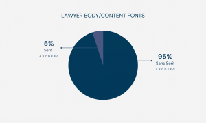
We found that only 5% of law firm websites used a serif font in their body content, and a whopping 95% used a sans serif font.
Even though you have options available, you should probably stick with a sans serif font on the body of your website.
From our observations, here are the top 5 fonts for law firm websites:
Here’s a recap when you’re choosing fonts:
- If there are any rules we need to follow, make sure you start with them. You do not want to have any information rejected because you did not follow the rules.
- Make sure it is large enough for the reader to see the information easily.
- Try to select one that catches the attention of the reader. If you can grab and hold the attention of your visitors, they will have an easier time digesting the material you put in front of them.
- Think about the personality and mood. Make sure this is an accurate reflection of the information you want to share.

If you keep these important tips in mind, you should be able to effectively communicate the right information to your readers. That is where our team can help you with your lawyer website design.
Why Are Fonts Important?
Even though you might not think much about the font you use, this is actually a very important element of your digital marketing strategy. There are several reasons why fonts are so important. These include:
Brand Recognition
If you keep your font consistent, you make it easier for people to recognize your brand. You need to build a strong brand identity to make sure your name sticks in the heads of your readers.
Decisions
Choosing the right typeface can also influence decisions. For example, if you use a font that catches the eyes of your readers, you may have an easier time convincing them to take a certain action. This could include calling your law firm to learn more.
Attention
Finally, you also need to make sure you hold the attention of your reader. If you choose the right font for your website, you will have an easier time doing exactly that.
Clearly, it is important for you to think carefully about the type of font you use. How do you figure out which font is best for your website?
Contact Law Firm Sites Today To Find the Best Font for Attorneys
Your Law Firm font is important, and you need to work with a professional designer who can help you put your best foot forward. If you would like help selecting the best fonts for attorneys, the team from Law Firm Sites can help you.
We have a variety of lawyer fonts, and we can help you navigate the web design process from start to finish. Our attorney web designer will work with you closely to ensure you get the most out of your digital presence.
We will work with you personally, helping you make a positive impression on everyone who visits your website. Contact us today to learn more about our services! It would be our pleasure to assist you.
Enjoy this blog? Here are some other posts we think you’ll like.
What Are The Best Colors for a Legal Website?


Did you like this post? Here are some others you might enjoy:

What makes a good design? Is it only about the appearance, or how each element serves a clear purpose? Good…
Why do some law firm websites look professional yet still fail to appear where potential clients are searching? In many…

Conversion rate optimization is the process of improving a website so that more visitors take a desired action. For law…
